“Art enables us to find ourselves and lose ourselves at the same time.”
—Thomas Merton, No Man is an Island
The Church has long recognized the profound power of beauty to evangelize, catechize, and heal. Still, in the latter part of the 20th century, many historic American church interiors were white-washed (or in some cases beige-, gray-, blue-, or pink-washed), and many newer churches were built to the exclusion of art. After this period of fasting, however, there is in the Church a burgeoning appetite for a return to the via pulchritudinis—the way of beauty. An essential component of slaking the thirst for beauty in ecclesiastical settings is color.
Color Timidity and Audacity
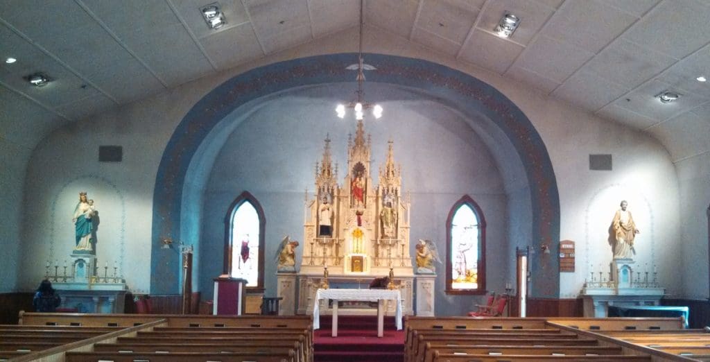
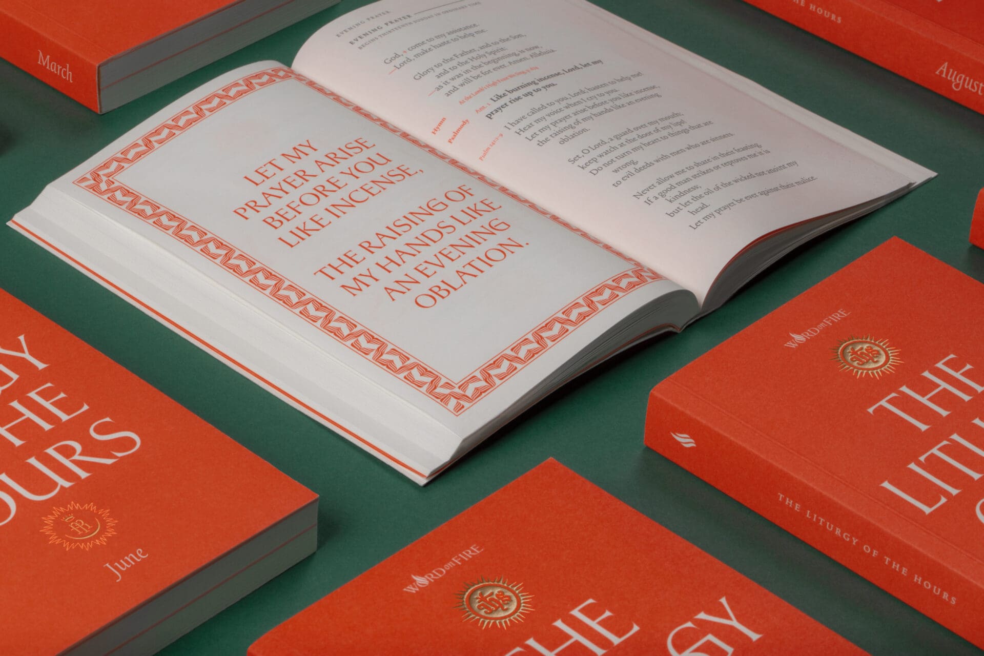
Image Source: Brands & Kribbs Photography
After so many years of sensory deprivation, many have grown shy about color and pattern. Will it be too busy? Too distracting? Too bright? On the other extreme we find no compunction to the arbitrary introduction of color, pattern, and imagery irrespective of scale, saturation, and relationship to adjacent ornament. If applied indiscriminately, color and decoration can indeed be a distraction. Both extremes are the result of a lack of literacy when it comes to art and architecture—or perhaps more of a forgetting that, like the other great arts the Church has used to glorify God, such as music, church buildings are meant to be read, heard, and otherwise engaged by the faithful. Art and architecture speak. When done well, ecclesiastical art and architecture should speak to each other—and speak to us.
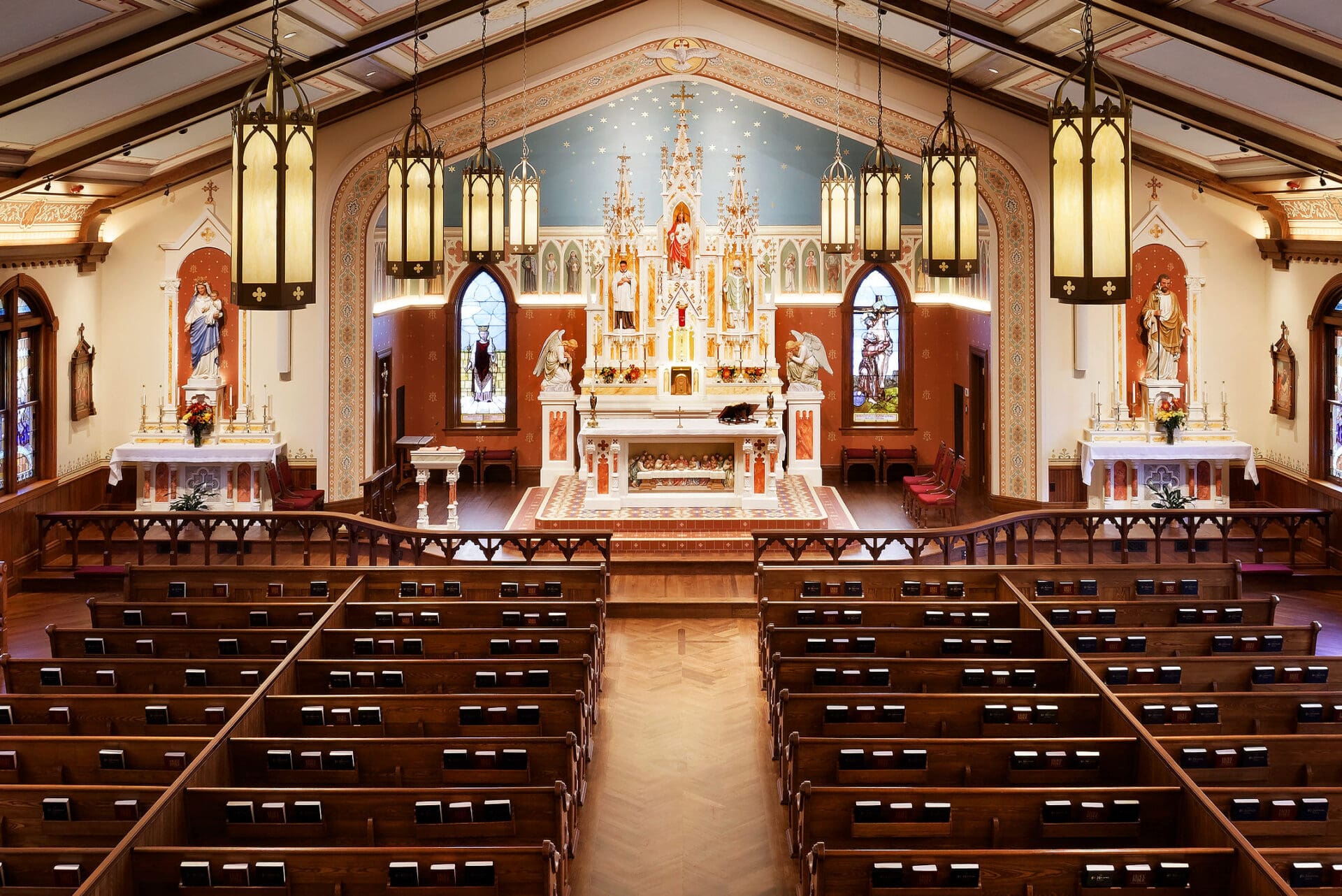
Image Source: Brands & Kribbs Photography
One of the great strengths of communication of this sort is its ability to transcend time and spoken language. A friend of mine, a priest who heard confession at the Cathedral of Notre Dame de Paris for decades, told me about an encounter he had, many years ago, with a twenty-something-year-old American tourist in sneakers. The young man entered the Cathedral, turned to my friend, a priest he had never met, and said, “This is the most beautiful thing I’ve ever seen. Tell me about God.” At their best, art and architecture can be powerful mystagogical instruments, deepening our understanding of the mysteries of faith and supporting the heavenward pilgrimage of all who enter a church. Pope Benedict XVI said in a general audience address that “Art is capable of making visible our need to go beyond what we see and it reveals our thirst for infinite beauty, for God” (August 31, 2011).
Applications of color, including foundation colors, accent colors, the arrangement of color to create repetitive patterning, figurative artwork, and other decorative works of art are all proper to the discussion of color and ecclesiastical artistry. At their best these color techniques should collaborate with the architecture to move the eyes and body through the building. We often think of beauty as a superficial luxury: If we have excess money to throw around, we may throw some of it at the walls to make them beautiful. If we are practical, hardworking, and conscious of the suffering of others, beauty may feel like a scandalous indulgence. However, when we look to nature, we find beauty is never frivolous. Beauty has a very specific job: to draw the spectator in. We need only look at a flower that beckons a bee, or a peacock a mate, to see this in action among the things of nature and to know beauty is not the end point but an entry point. Therefore, we can say that as an entry point, the job of ecclesiastical artistry is both formalistic (to support the architecture) and theological (to support the liturgy).
Effective use of color and decoration are informed by the properties of beauty defined by St. Thomas Aquinas: integrity (integritas), harmony (consonantia), and clarity (claritas). Uncompromising adherence to these principles doesn’t necessarily mean spending more money. (Although it is remarkable to consider the immigrant communities built across the United States in the late 19th century through “sweat equity,” that is, giving of their time and talent if not their treasure.) The way color is perceived in architecture is influenced by several factors, including: interplay of light and shadow created by the geometry of the building, as well as natural and artificial light and whether there is stained glass; relationship to adjacent colors; and atmospheric perspective, which causes muting of colors due to the distance at which they are viewed. These complex factors mean there is no fixed formula for the selection of colors. That is not to say however that color selection is a subjective endeavor. Adherence to or dissent from the principles that govern the relationship between colors determine palette harmony.
Church buildings are meant to be read, heard, and otherwise engaged by the faithful. Art and architecture speak.
The most beautiful color schemes result from harmonious color relationships. Formalistic considerations of the colors should include: palette, hue, value, chroma, and temperature. Colors should be informed by the architecture and historic precedent. Traditionally, earth-tones are the foundation colors closest to the ground and lower levels of the church, informed by natural building materials such as stone, clay, and wood (gray, tan, reds, and browns). The colors graduate to celestial colors in higher areas: blues and golds. Stronger colors are used in moderation as accents. This approach allows greater control over the way the building is experienced and opens the palette up to include a greater diversity of colors without feeling garish.
There is a tradition in fine art of reserving blue (which was at one time made from lapis lazuli, a semi-precious stone from Afghanistan, making it the most expensive pigment) for the garments of the Blessed Virgin. Using this special color in a purposeful manner in figurative painting effectively identifies Mary and draws attention to her unique status, no matter how the artist chooses to portray her facial features. Unfortunately, many churches dedicated to the Blessed Virgin seeking to make use of this symbolic color are painted a monolithic light blue evocative of a swimming pool. Thus, while the theological concept is present, the formalistic considerations are absent. St. Mary’s Church in Aspen, CO, suffered from pool-blue syndrome with the vast sanctuary area covered in flat blue paint without patterning, accent colors, or any decoration to move the eye, set against a cool uninterrupted white foundation color throughout the church. The effect was icy. A palette with a warm neutral foundation color on the walls and red accent colors can support prominent use of the color blue in the sanctuary and nave ceilings without feeling cold.
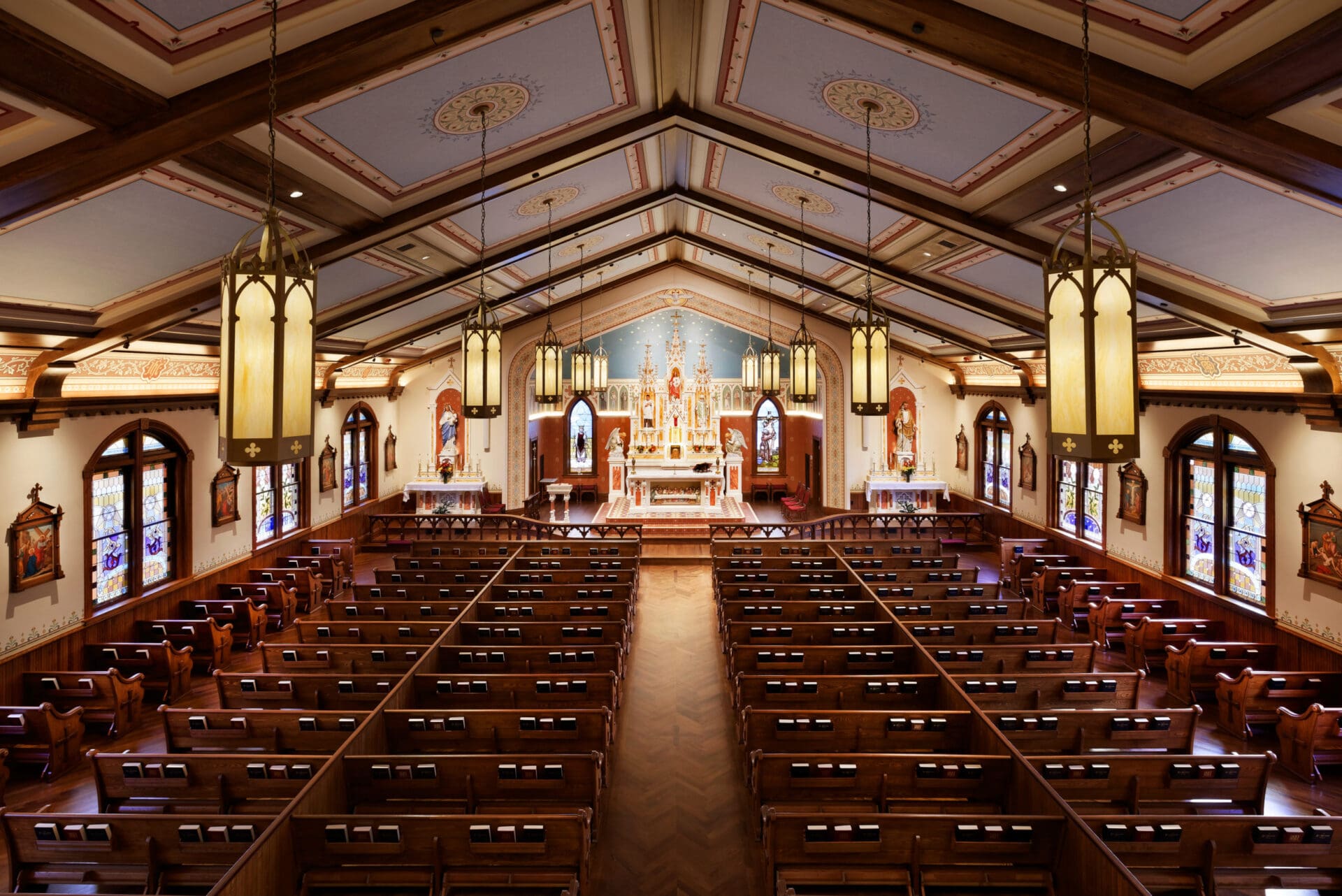
In St. Mary’s 2018 renewal, deep colors in the sanctuary provide contrast with the reredos making it appear more prominent. The architectural nature of the reredos is suggestive of a church building reaching into the heavens while an entablature created using trompe l’oeil (a painting technique which gives the illusion of three dimensions on a flat plane, derived from the French for fool the eye) featuring portraits of saints (cloud of witnesses) is suggestive of the walls of the heavenly city, a reminder that when we participate in the Holy Sacrifice of the Mass we share in the heavenly liturgy. Introduction of three-dimensional trusses and painted ceiling coffers with borders and decorative medallions break up the expansive ceiling, creating a better sense of proportion, and rhythm (relating both to the natural heartbeat and the liturgical procession). One feels at ease when colors and scale are in harmony.
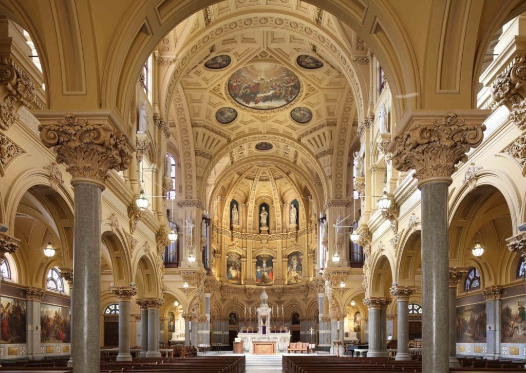
Image Source: Whitney Cox, EverGreene Architectural Arts, Whitney Cox
Two Churches, One Beauty
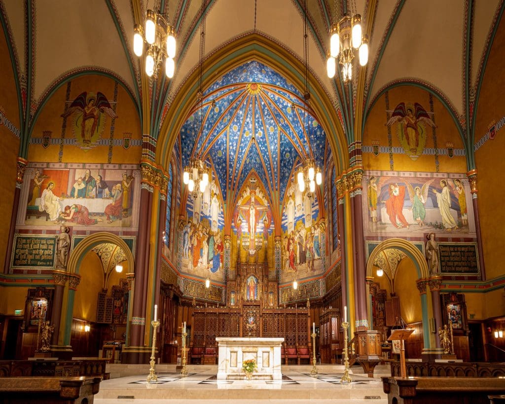
An examination of two very different historic churches is instructive in the use of color: St. Francis Xavier Church in Manhattan, NY, and Cathedral of the Madeleine in Salt Lake City, UT. Both take a similar ochre foundation color and both use color to great effect but in very different ways.
St. Francis Xavier’s architecture features significant raised (three-dimensional) ornament including evangelists sculpted into the crossing corners, foliated capitals (in the form of leaves) and other ornate sculpted elements, and striking murals of the Stations of the Cross, St. Francis Xavier, angels, and the crucifixion. St. Francis Xavier’s palette is rather stayed: we find true marble in the columns, floors, and lower walls (a mix of warm and cool earth-tones), with a warm foundation color. Highly saturated colors are reserved for murals and stencils (two-dimensional ornament). The murals are naturalistic (believable likeness of figures). A significant aspect of the color palette is the use of glaze (a transparent pigment). When applied to raised ornament, glaze settles into recesses and highlights are created when the glaze is wiped off the tops. The effect is greater articulation and legibility of the architectural elements which helps the eye decipher shapes into recognizable forms. The ornament is abundant and the scale is vast, but it is serenely ordered. The architecture and the program of color are harmonious: they work together to create a strong sense of rhythm and procession, drawing us into engagement with the symbolism and biblical narrative. While discord and disparity are realities of the fallen world, the art and architecture at St. Francis Xavier Church invite us to contemplate return to the order and abundance of the garden of Eden.
While discord and disparity are realities of the fallen world, the art and architecture at St. Francis Xavier Church invite us to contemplate return to the order and abundance of the garden of Eden.
The Cathedral of the Madeleine uses a similar foundation color as St. Francis Xavier but the liturgical artistry program is exuberant and ecstatic! The interior of the Cathedral of the Madeleine is enrobed with vibrant colors, pattern, and figurative imagery. The unfettered application of decoration is evocative of Christ’s anointment with precious perfume (Matthew 26:7). What was achieved with three-dimensional ornament at St. Francis Xavier is here realized with color. For example, the raised ornament (such as ribs and capitals) at the Cathedral of the Madeleine is simpler than at St. Francis Xavier, but all are enriched, emphasized, and enlarged by the use of color, gold, patterning, and figurative painting. The highly saturated sanctuary is teeming with celestial activity (stars, comets, and angels), text, richly carved furnishings, and a dynamic cloud of witnesses pull all who enter towards the sanctuary. We find here a palette and figures purposely stylized and other-worldly to emphasize the radical difference of the heavenly reality with the terrestrial.
Color in Other Styles of Architecture
The most effective examples of ecclesiastical decoration subtly imbue formalistic elements with theological content. This can be achieved in any style of architecture if care is taken to integrate the artistry program with the architecture.
Gothic architecture invites contemplation of salvation through imagery of the forest and the return to Eden, both of which express the state of perfect abandon to the will of God. A common example of this sort of artwork is the design of clustered columns like tree trunks reaching heavenward with branch-like ribs ornamented with foliated and fruited capitals. Peering through the “branches” we may see stars that help us recall God’s promise to Abraham and the sign of the Savior’s birth given to the Magi. In addition to the narrative imagery in windows, stained glass filters light through color in a way reminiscent of the dappled light filtering into the forest through leaves. Foliated motifs with a directional thrust towards the altar create a sense of procession and emphasize the centrality of the Eucharist in the Mass. A common casualty in post-historic renovations of Neo-Gothic churches are borders. On the theological side, painting over borders obscures the metaphor of the garden. On the formalistic side, borders enlarge the artwork they frame, allowing the art to be held in place by visual tension. Without borders, the artwork can float in space like postage stamps on an envelope, and the contrast between finely painted figurative murals and the white or beige wall is too stark, making for an abrupt or discordant transition from art to architecture.
The job of ecclesiastical artistry is both formalistic (to support the architecture) and theological (to support the liturgy).
Many insensitive post-historic renovations have sought to impose a style of artwork that is discordant with the architecture. Undecorated walls of a Cistercian monastery in Europe may be ideal for monastic contemplation and the architecture of that particular kind of building, but that doesn’t make painting the walls, ceilings, and ornament of a parish church in the Gothic style all white a good idea. Every aspect of liturgical art—the color of the walls, the style and placement of the decoration, the subject of the artwork, and the quantity of decoration—should be guided by the specific architecture it decorates and the community it serves.
Be Not Afraid
It is often said, “They don’t make them like they used to.” Perhaps they don’t. But beautiful liturgical artistry and appropriate use of color is possible today in any kind of building—including new churches. The key to appropriate employment of color in Catholic churches is to follow the principles of color theory and to be uncompromising when it comes to striving for beauty in the house of God.
When considering how to incorporate color into a historic or new church, keep the following in mind:
- Be not afraid to use color—but be sure to rely on the basics of color theory.
- Rely on historic precedent—but remember the color and style or decoration should always flow from the architecture and collaborate with it to support the liturgy and the community it serves.
- The constituent parts of beauty in the classical sense are integrity, harmony, and clarity. These should be the measure for any architectural project.
- Beautiful churches can be made today and, for those who can’t start from scratch, ugly churches can be made more beautiful.
- The objective of all liturgical art is to provide an encounter with the source of all beauty, God.
The Shades of Colorful Language: A Lexicon
- Palette: The selected range of colors intended for use—in the case of establishing a palette for an interior painting program it would identify the foundation colors for use in large areas such as walls and ceilings; prominent materials used in flooring, columns, visible beams or trusses, ornament, and furnishings; and accent colors used in patterning and figurative artwork. A harmonious palette is one in which the colors are of a family.
- Hue: What we think of as color—red, orange, yellow, green, blue, etc.
- Value: Relative light and dark—two different colors (such as a midnight blue and a deep forest green) are different colors (one is more blue and the other more green) but could carry the same relative value in terms of their relative darkness. In practical term this means either would carry the same visual weight in a composition.
- Chroma: Saturation/intensity—foundation colors will typically be more neutral and therefore lower in chroma (such as lighter golden colors, tans, and off-whites), whereas accent colors used for figurative painting, patterns, simple lining (using a relatively thin band of a single color to accentuate ornament), and cutting in color (introducing an accent color on panels or other discrete areas within the architecture) will be higher in chroma and appear more vibrant.
- Temperature: Coolness or warmth of a color—colors with blue and green undertones are cool and recede in space, while colors with red and yellow undertones are warm and will come forward.
Emily Valentine Sottile is an expert in ecclesiastical art and architecture. As director of the Sacred Space Studio at EverGreene Architectural Arts in Brooklyn, NY, Emily draws on formal training in art history and theology—and over a decade of hands-on experience bringing large-scale restoration and new design projects to fruition—to develop artistry and restoration programs to support the liturgy and architecture. Emily is an adjunct professor at St. Joseph’s Seminary, Yonkers, NY, and frequent contributor to The Chair documentary series (Amazon Prime). Emily holds a BA in History of Art from Rhodes College, Memphis, TN, and an MA in History of Art from the University of Edinburgh, Scotland.
Feature Image Source: Brands & Kribbs Photography